Observable is proud to announce the Chart cell, a new cell type that helps you interactively explore data visually without writing a line of code.
We’ve heard from our users that building visualizations to assist the data analysis workflow can be tedious. Today’s tools often expect you to know how you want to present the data before writing the code that lets you see it. That’s why we built the Chart cell, to help users get to those “ah-ha!” moments faster and easier than ever before.
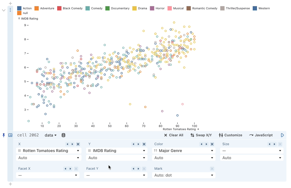
Point the chart cell at any data source and select the columns that interest you. The Chart cell intelligently generates a visualization based on your selections. All it takes is a single column to get started. You can set reducers on each channel to aggregate the data, and you can facet your chart with the flip of a switch. All of the automatically selected settings can be overridden, allowing you to customize the visualization as needed.
Check out the Chart cell documentation for more information.
We hope this new cell type accelerates your analysis and gives you new ways of understanding your data. We would love to hear your feedback as you use it! What is useful? What is it missing that we should think about for future updates?