You can still click on the cell’s name to the left of the dots to immediately toggle the cell. There’s also one more perk: you can click at the bottom of a notebook to quickly add a cell there, without having to target the button.
We’re making room for some upcoming features, as well as improving the mobile and narrow-screen experience. Where we previously had an awkward toggle to see cell names on mobile - and no way to permalink those cells - we now have an immediate place to click to trigger editing, permalink, or delete cells, on both mobile & narrow-screen devices like iPads.
I’m a bit ambivalent regarding the ui change. I liked the triangle that simply opened a cell, ready to edit. Now I need two clicks to do that. I find that harder, more obtrusive. I found the old delete cell harder, requiring two clicks.
How about having a trash can next to the pushpin next to the triangle, with sufficient space between the to avoid clicking errors?
Thanks for all replies! I totally missed that you can simply click in the huge margin area to open en close a cell. Wonderful. I withdraw my remarks. Great improvement. Thanks Observable Team.
I like these changes, but a minor note: I no longer seem to be able reorder cells on mobile (iPad/Safari). Before I could click the arrow buttons, but the new drag mechanism does not appear to be activated on touch events. Unless I’m missing something?
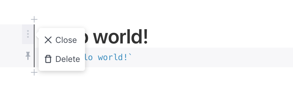
One problem with this design is the edit and delete button are so close to each other that it’s pretty easy to accidentally delete when I meant to edit. Maybe I missed it but there doesn’t seem to be an easy way to undo a cell deletion… Anybody know a good way to go back one version?
Thanks for the feedback. We’ve added an extra click to confirm that you want to delete the cell.
Also, here’s a new hidden feature that’s handy for viewing recent changes: for a notebook you own, you can show the ten (or however many) most-recent changes like so:
If you then choose “Compare reverse” from the notebook menu, you can click Merge to undo the changes. We’ll add better history browsing in the near future to make this easier.
I really liked how an empty cell would automatically get deleted if it was empty. Seems like you could bring that feature back and it would still fit in with the new changes. The other changes are great!

 button.
