Y styling not displaying after declaring y domain

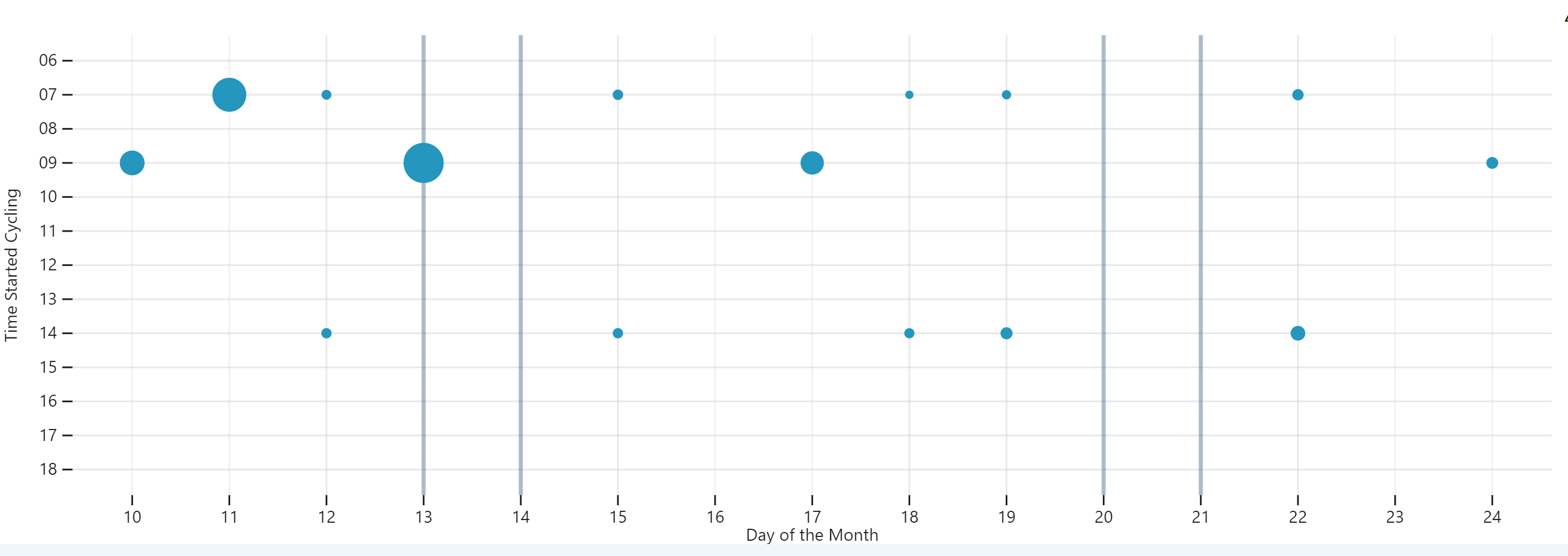
Hi. A very newbie question. I have sparse data and I needed my y- axis to display values at the regular interval in order to show the difference between the recorded data points. The solution I found created an array with the needed values and declared it as y domain (as seen in this @mbostock Plot: Tick notebook. However, this is preventing me from implementing any y related styling. I am attaching the images of both charts. One has the styling I need but the y-axis is truncated and the second one is at the right scale due to y axis fix but I cannot repeat the styling.


dotPlot2 = Plot.plot({
  width: Math.max(width, 550),

  //y: { grid: true, label: "Time started cycling" }, //, reverse: true },
  x: { label: "Day of the Month" },
  y: {
    grid: true,
    label: "Time Started Cycling",
    domain: y_axis_time ///
  },

  marks: [
    Plot.textX(
      data.filter((d) => d.DayOfWeek == "Saturday" || d.DayOfWeek == "Sunday"),
      {
        x: "dayOfMont",
        y: 7,
        text: "DayOfWeek",
        stroke: "#e57827",
        strokeWidth: 1
      }
    ),

    
    Plot.tickY(y_axis_time[11], {//not working
      stroke: "red",
      strokeDasharray: "2 2",
      dx: 20
    }), //not working

    Plot.ruleY(
      data.filter((d) => d.startHour == "12"), //not working
      { stroke: "red", strokeDasharray: "2 2" }
    ),

    Plot.tickX(
      data.filter((d) => d.DayOfWeek != "Saturday" || d.DayOfWeek != "Sunday"),
      { x: "dayOfMont", stroke: "lightgray", opacity: 0.3 }
    ),

    Plot.tickX(
      data.filter((d) => d.DayOfWeek == "Saturday" || d.DayOfWeek == "Sunday"),
      { x: "dayOfMont", stroke: "#042e5e", strokeWidth: 2.5, opacity: 0.3 }
    ),

    Plot.dot(data, {
      x: "dayOfMont",
      r: "duration",
      fill: " #2596be",
      y: "startHour",
      //interval: 0.5,

      title: (d) =>
        `${d.DayOfWeek}\n Minutes Cycling: ${d.minutes}\n Date: ${d.date}     `
    })
  ],
  //width: 576,

  tooltip: {
    fill: "red",
    stroke: "blue"
  }
})

Would you be willing to share a notebook so that we can see the live code and make a suggestion?

Thank you for your help.

The main issue that I see is that you’re using ordinal (point) scales for both x and y, but since both dimensions are continuous I suspect that you want quantitative (linear) scales instead. If you add type: "linear" to your scale declarations in the dotPlot cell it probably looks much closer to what you intended. (And it also suppresses the warning that Plot is giving you.)

dotPlot = Plot.plot({
  width,
  x: { type: "linear", label: "Day of the Month" },
  y: { type: "linear", grid: true, label: "Time started cycling" },
  marks: [
    Plot.text(
      data.filter((d) => d.DayOfWeek == "Saturday" || d.DayOfWeek == "Sunday"),
      { x: "dayOfMont", y: 7, text: "DayOfWeek", dy: -20 }
    ),
    Plot.tickY([12], { stroke: "red", strokeDasharray: "2 2" }),
    Plot.tickX(
      data.filter((d) => d.DayOfWeek != "Saturday" || d.DayOfWeek != "Sunday"),
      { x: "dayOfMont", stroke: "lightgray", opacity: 0.3 }
    ),
    Plot.tickX(
      data.filter((d) => d.DayOfWeek == "Saturday" || d.DayOfWeek == "Sunday"),
      { x: "dayOfMont", stroke: "#042e5e", strokeWidth: 2.5, opacity: 0.3 }
    ),
    Plot.dot(data, {
      x: "dayOfMont",
      r: "duration",
      fill: " #2596be",
      y: "startHour",
      title: (d) =>
        `${d.DayOfWeek}\n Minutes Cycling: ${d.minutes}\n Date: ${d.date}     `
    })
  ]
})

The reason that you’re getting ordinal scales is that your dayOfMont and startHour fields are both defined as strings rather than numbers. One way to fix that is to coerce these to numbers when you declare the channels:

Plot.dot(data, {
  x: (d) => +d.dayOfMont,
  y: (d) => +d.startHour,
  r: "duration",
  fill: "#2596be",
  title: (d) =>
    `${d.DayOfWeek}\n Minutes Cycling: ${d.minutes}\n Date: ${d.date}     `
})

But better would be to fix the data so that numeric columns are represented as numbers; then Plot can do the right thing by default.

You can read more about scales in Plot here:

1 Like

Thank you for your time. I should have got that. Duh. :slight_smile:

1 Like

Hm. Me, again. I have solved most of my problems and am working on a fork as had an issue that one of the data sets is straddling a border between two months. I had to re-think how I did things. I should have used type : “time” in combination with interval from the start but you live and learn. Now, the issue is that the centres of the circles lie right on the y-axis (as they should) and I can’t figure out how to offset them by the radius of the circle so that they lie within the hour boundaries. I have found some d.3 examples but I can’t figure out how to do it with Plot. I am sure it is easy. :frowning:

PS I know there are other ways, better ones for presenting this but I cannot change the design as it needs to be consisent accross the study.

Would the scale inset option work for you?

Thanks for finding time to reply but it seems, inset does not help. I thought that the object ‘dot’ would have some parameters that can be modified. Naively, I thought that y attribute would be transformed into cy that can then be manipulated as whether y is ordinal, categorical or numerical, cy would have to be a numerical value and mutable.

I’m not sure I follow the latest problem. Can you post the code and image and describe what you want to happen? (I clicked the link to the fork above but I couldn’t figure out what you were referring to.)