Hi! I’m new to Observable and have some experience with R and ggplot, but not much with javascript! Trying to figure out how I could use the checkbox tool to selectively display certain years on my graph.
You can find my project here: Visualizing Global Warming by Cities in America / William Pang / Observable
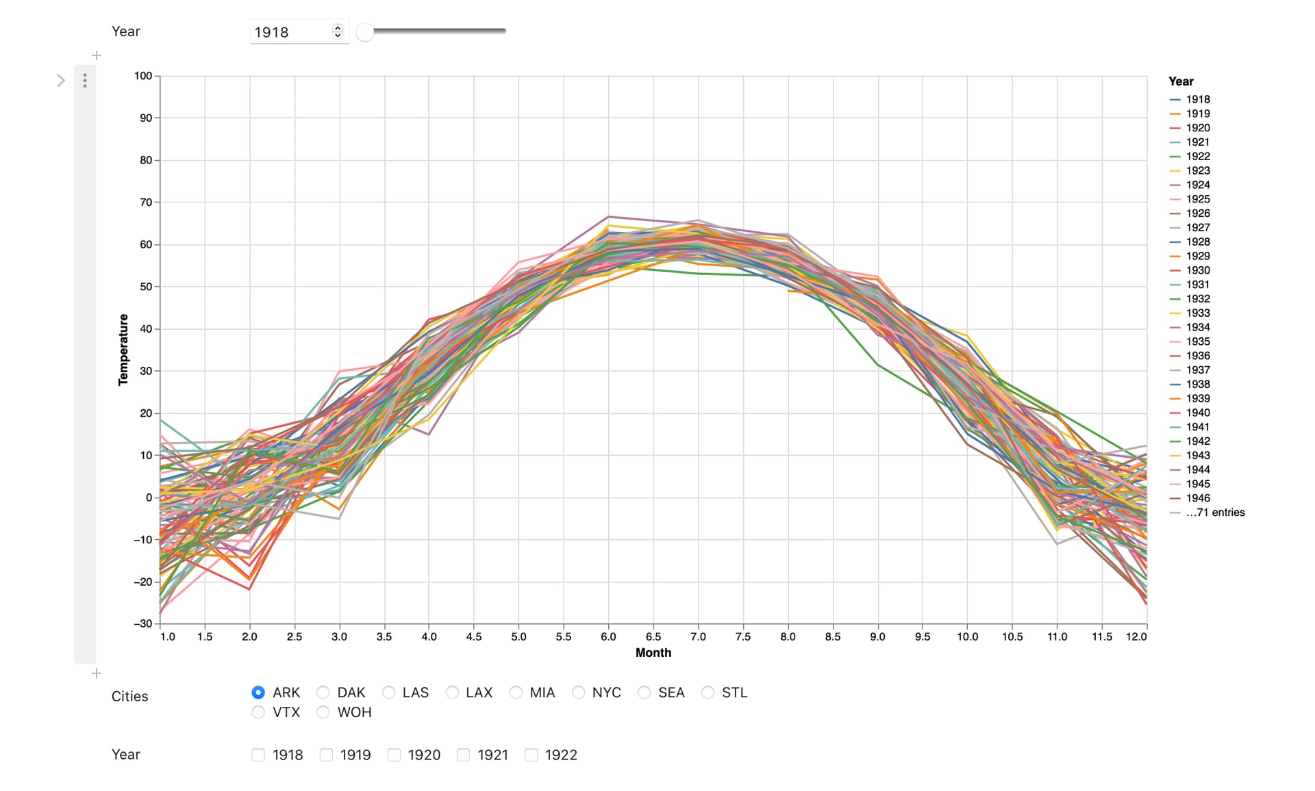
As you can see, this graph is super super messy:
What I want to do is to be able to use the checkboxes to subset certain years (for example, I want to compare the temperature trend in the year 1920 vs 2006) rather than have it display a full blown graph like this. I was wondering whether anyone has some tips/suggestions!
Thanks!!